
Loveday is a fictional cosmetics and wellness brand developed as an ongoing design case study. Created with bicycle tourists and outdoor enthusiasts in mind, the brand focuses on personal care products designed around the needs of people who spend long hours cycling and traveling outdoors.
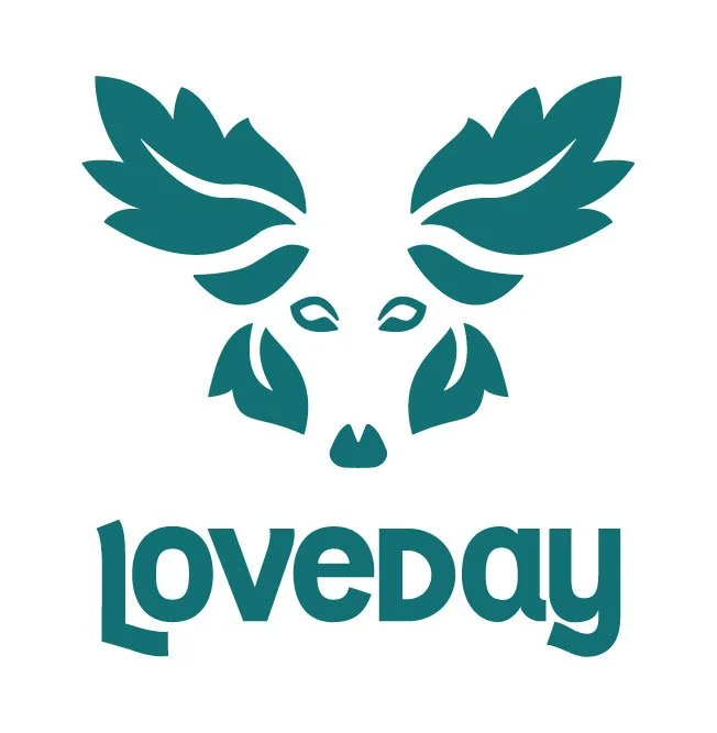
I developed Loveday's visual identity, beginning with an original logo inspired by American and British folklore.
The logo combines the face of a coyote with leaves, drawing inspiration from the American coyote and the British Green Man. The design features an original illustration and customized lettering.
The name Loveday is a British surname historically associated with days designated for resolving disputes and making peace. I also named my own bicycle Loveday because, to me, any day I get to ride my bike is a lovely day.
This case study is still in progress. I'll be extending Loveday's visual identity across product packaging, a website and interactive prototype designed in Figma, a PowerPoint pitch deck, and potentially more pieces.
More coming soon.