
Chicago Catholic Community Connections (C4) is a multi-parish community for adults who have outgrown traditional young adult groups but still want opportunities to build friendships and connect with their faith.
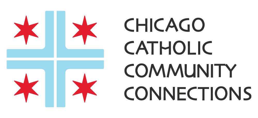
I developed C4’s visual identity, including the logo, color palette and typography.
I wanted the identity to reflect both its Catholic roots and its connection to Chicago, using a color palette inspired by the Chicago flag and typography influenced by lettering commonly seen in churches and Catholic media.
I reworked the flag’s four six-pointed stars and blue stripes into a cross, creating a mark that connects the group’s faith with the city and the different parishes its members call home.
The four-part structure also leaves room to explore a future connection to Catholic chaplet traditions.
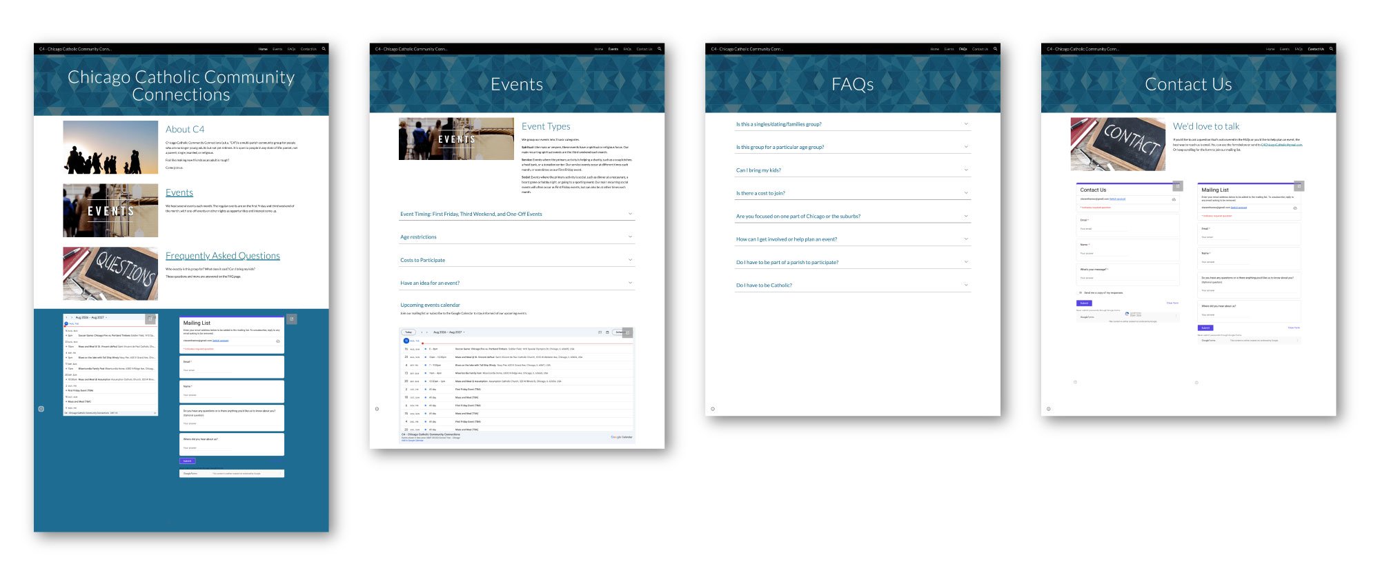
After developing C4’s logo, I wanted to begin building out the visual identity and bring it to the organization’s website.
C4 had a functional website that another member had created in Google Sites, which served as my starting point for the redesign.
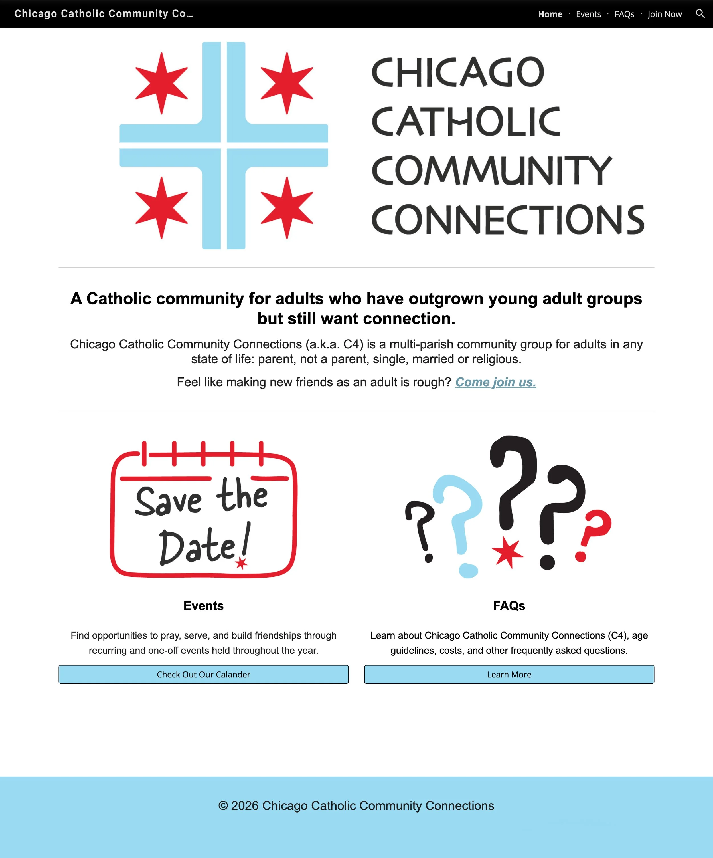
I redesigned the existing Google Sites website within the budget and technical constraints of a volunteer-run organization.
I brought the site into the new visual identity, increased type sizes to improve legibility and accessibility, simplified information-dense content, and created clearer paths to events, FAQs, and joining the group.
I also created all of the hand-drawn icons and illustrations used throughout the site, replacing generic imagery with a visual system built around the organization’s identity.
I used ChatGPT as a writing tool to help streamline copy and prioritized the full Chicago Catholic Community Connections name over the less familiar “C4” abbreviation.
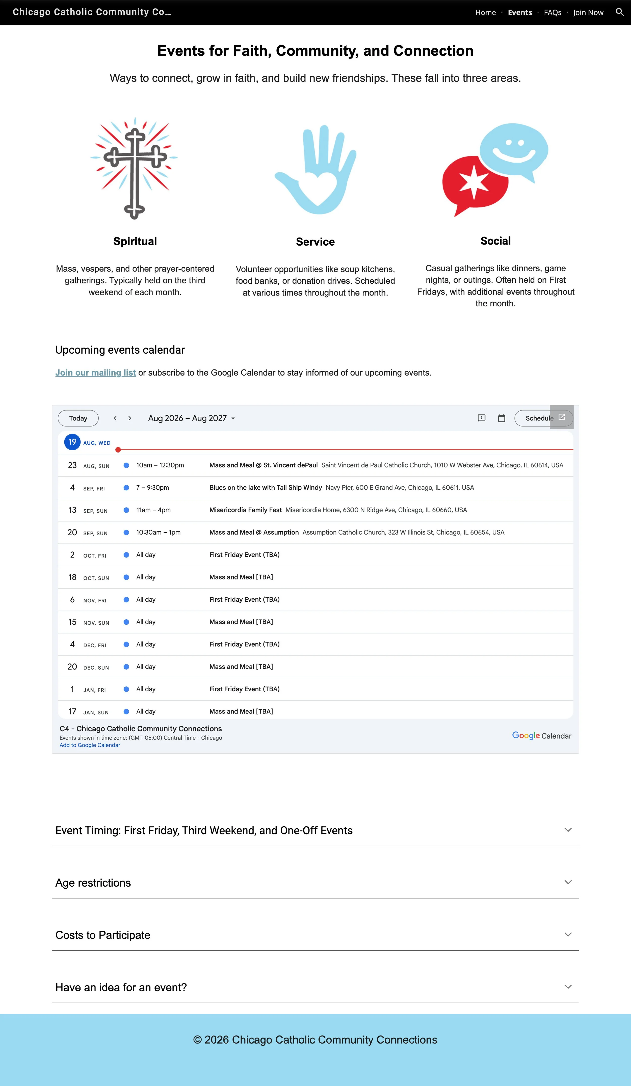
I reorganized the Events page to make the group’s programming easier to understand at a glance, introducing three categories: Spiritual, Service, and Social.
I designed individual icons for each category as part of the illustration system used throughout the site.
Event-specific questions appear here as well as on the FAQ page, giving visitors multiple paths to information depending on how they navigate the site.
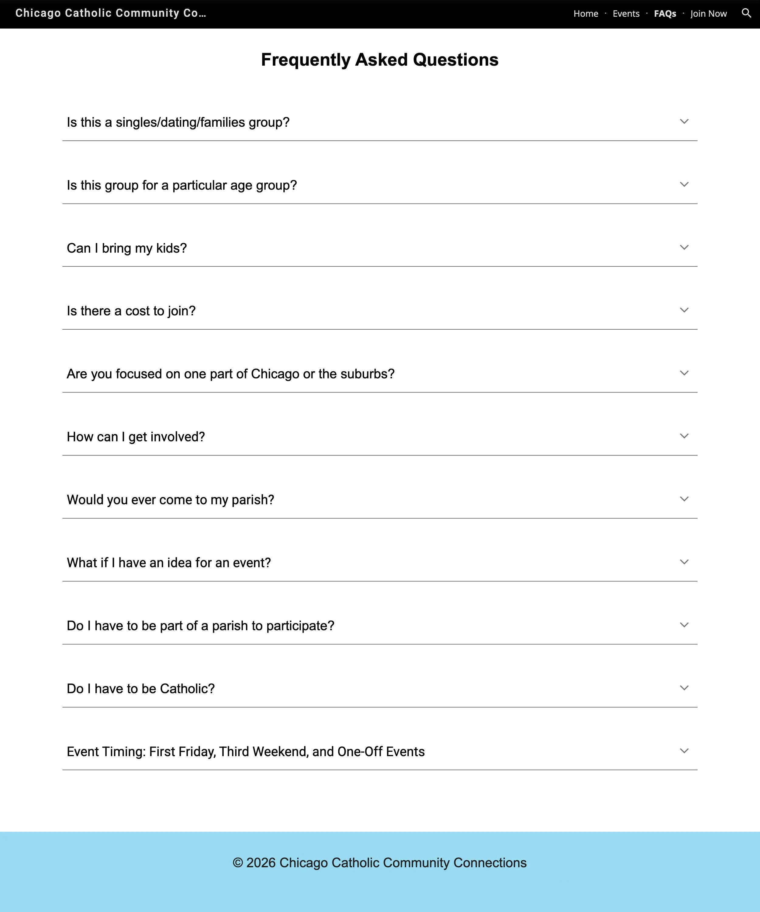
The FAQ page required fewer structural changes, so I focused on content clarity and findability.
I refined the tone and terminology and added event-related questions from the Events page, allowing visitors to find those answers whether they begin with a specific event or the site’s general FAQs.
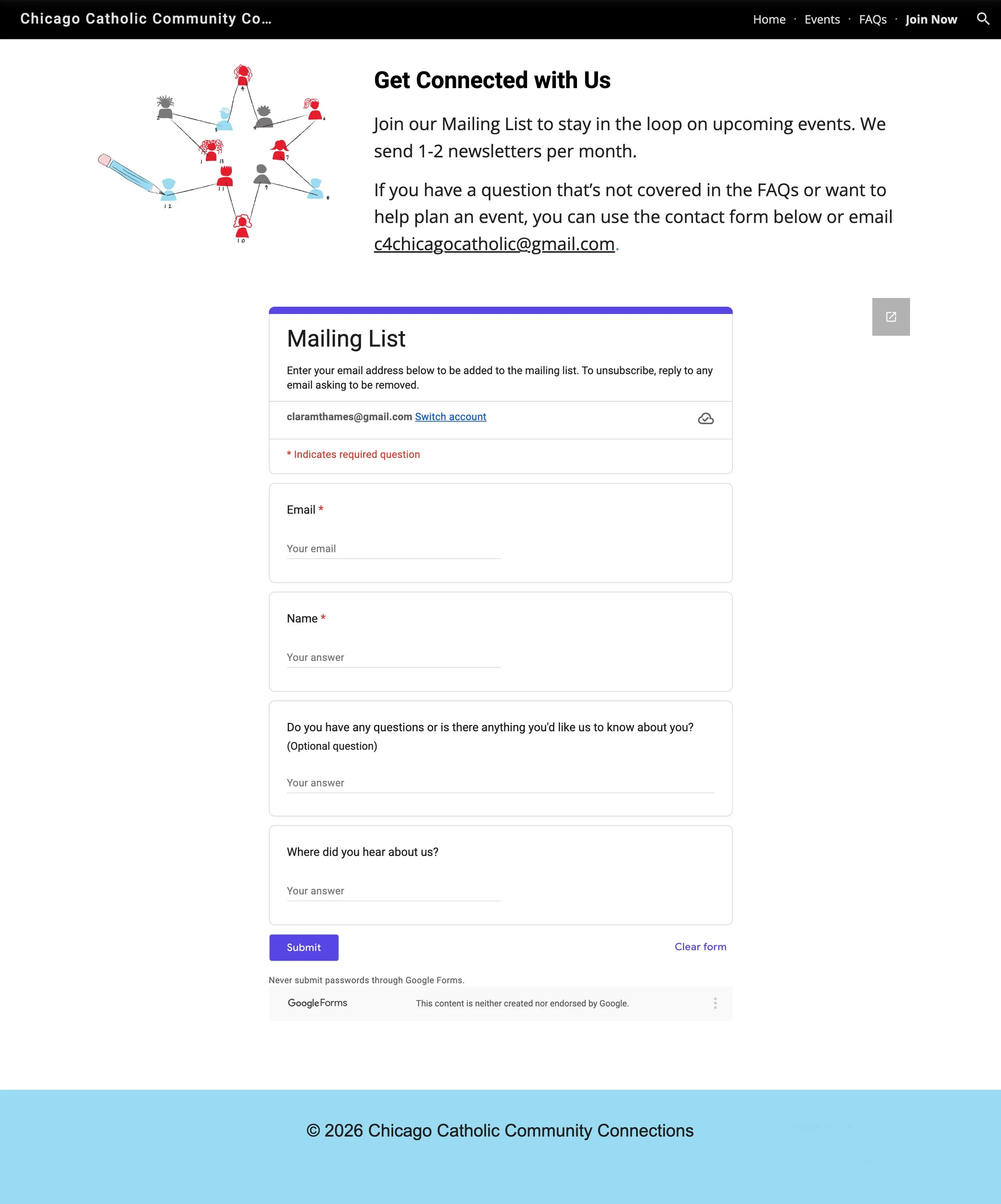
I reframed the former contact page around participation, using “Join Now” in the navigation and “Get Connected With Us” as the page message.
I replaced the generic contact imagery with a custom connect-the-dots illustration: small figures form the points of a Chicago star, creating a visual metaphor for people connecting through the organization while extending the illustration and brand system across the site.