
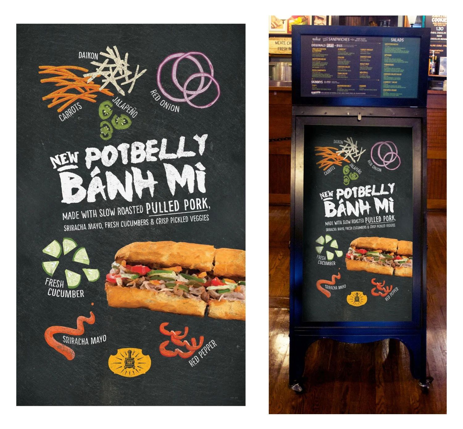
I worked with the creative team to develop the visual direction for the seasonal Bánh Mì campaign, using a chalkboard-inspired treatment that fit within Potbelly's existing brand.
I illustrated the individual ingredients and helped establish the typography, composition, and overall layout.
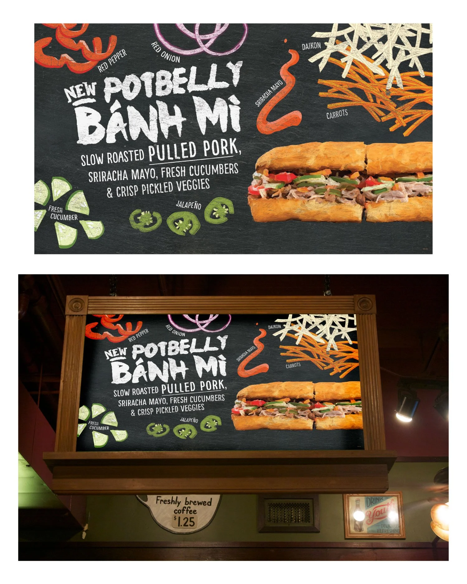
The campaign artwork was adapted to a horizontal hanging sign, requiring a new composition while maintaining the same illustrated ingredients, typography, and chalkboard aesthetic.
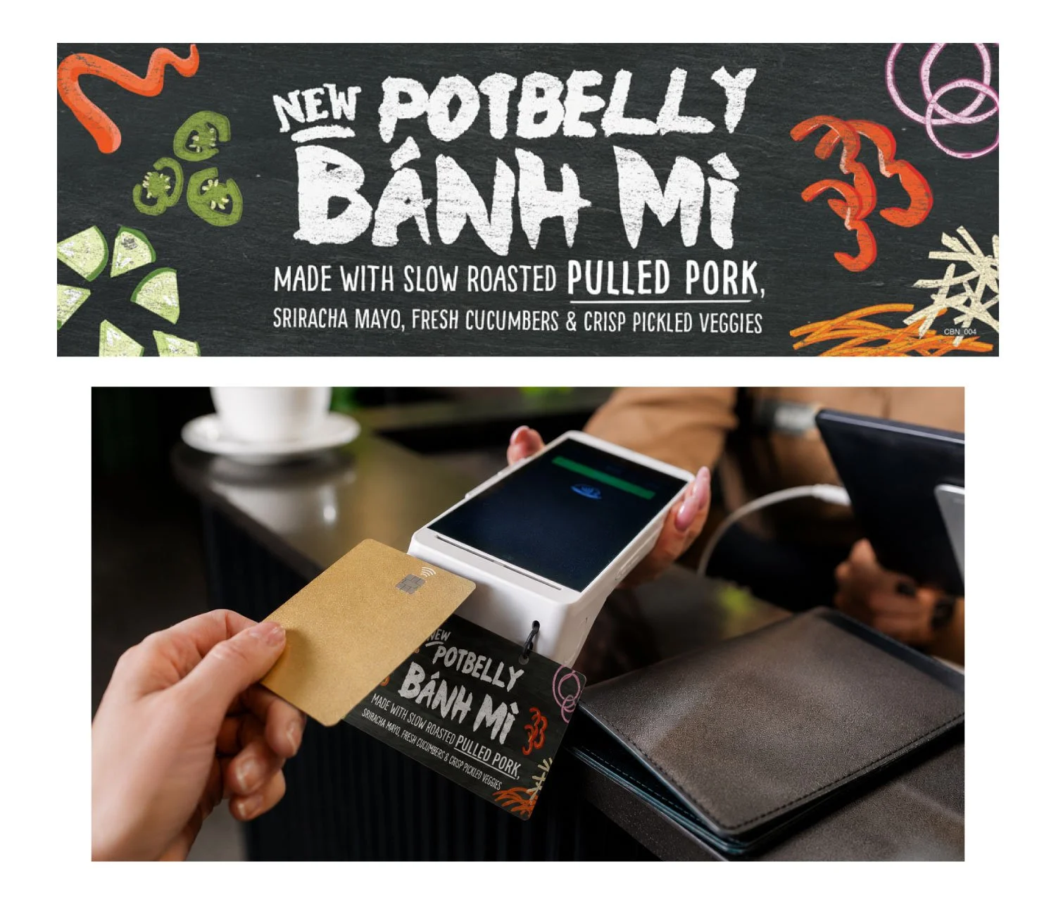
For this small-format point-of-sale piece, I condensed the campaign into a narrow layout designed to hang from the handheld ordering device used by employees taking orders during busy periods.
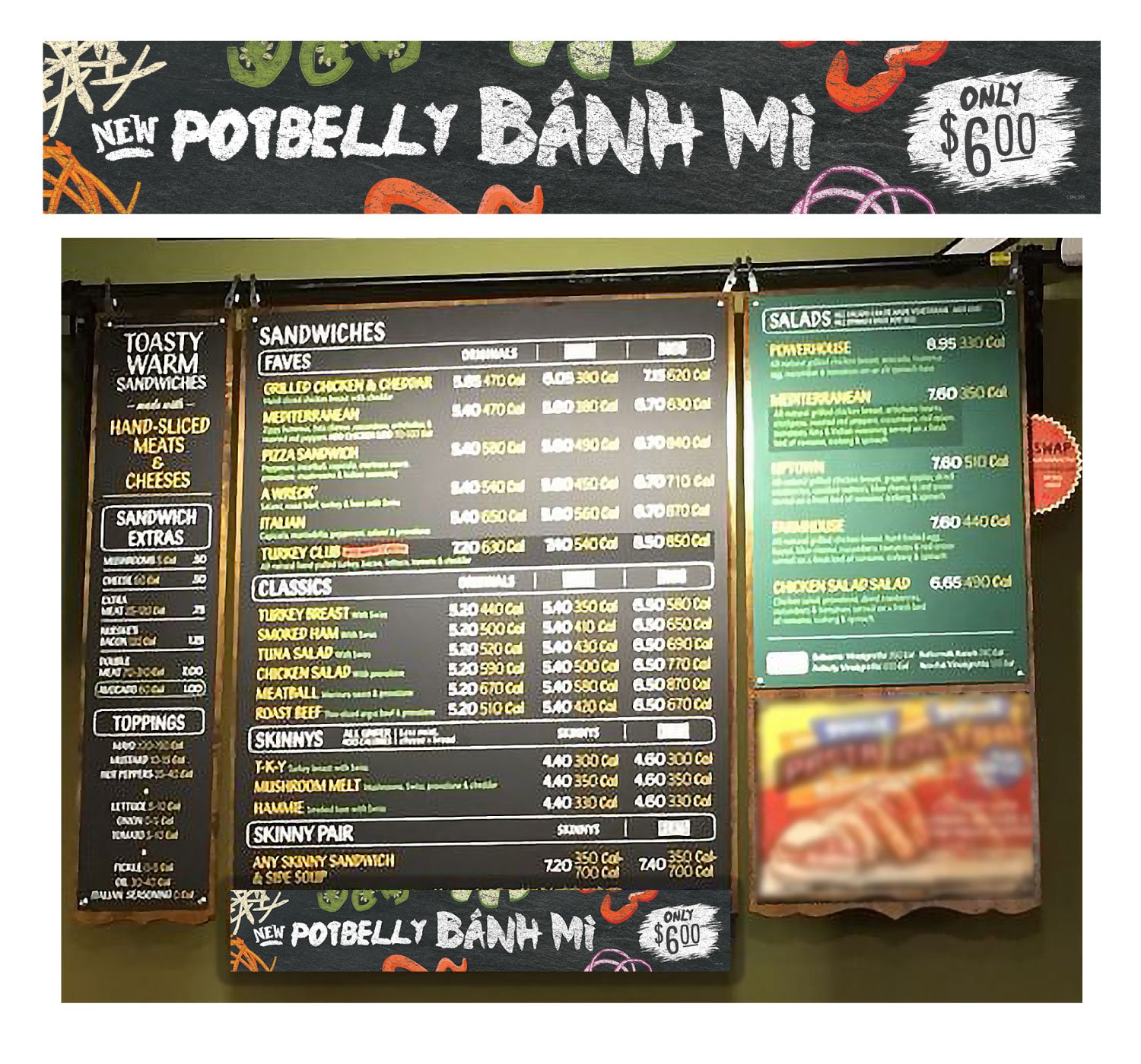
This narrow promotional sign attached to the bottom of the shop's menu board. I reworked the campaign hierarchy and illustrations for the unusually wide format while keeping the seasonal sandwich immediately recognizable.
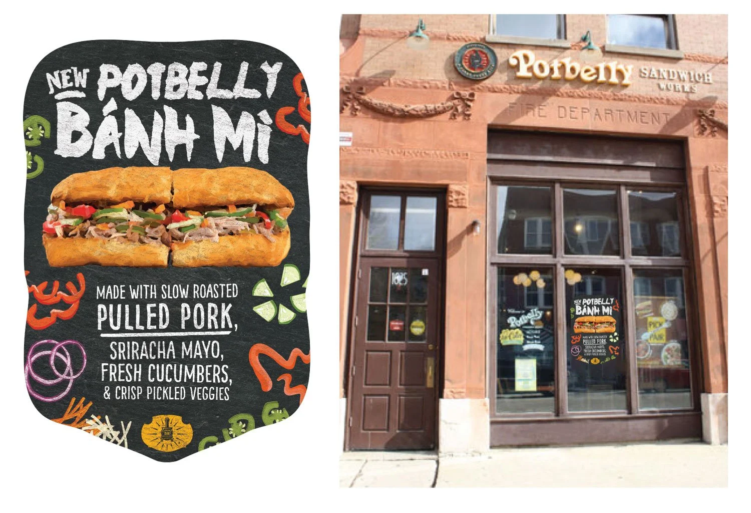
The Bánh Mì campaign extended to large-format window signage designed to attract customers passing the shop.
I adapted the campaign artwork for long-distance visibility, testing the design at different viewing distances to ensure the sandwich name and key messaging remained clear from across the street.
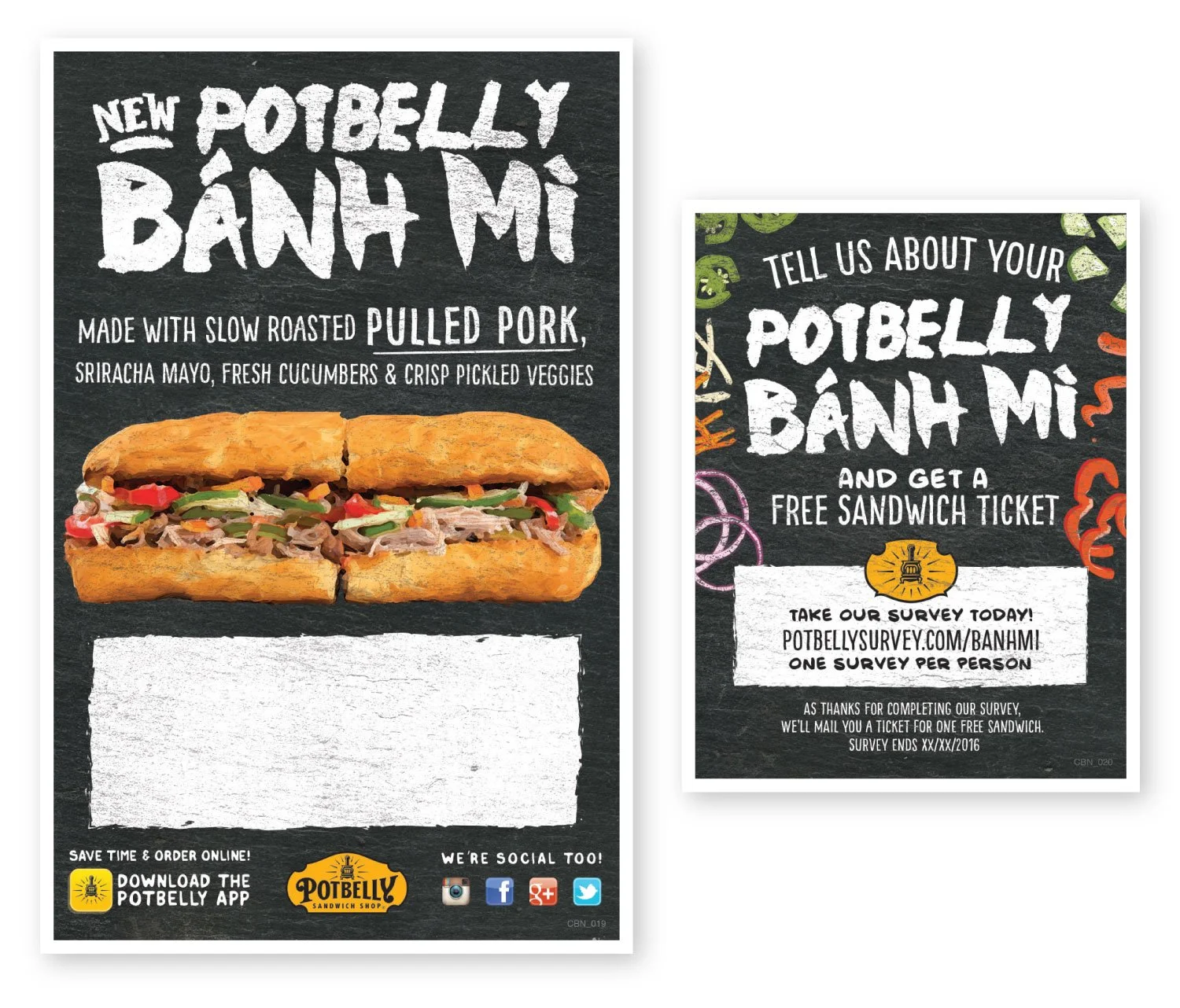
I adapted the campaign for smaller take-away materials, including a customizable shop flyer and a survey piece offering customers a free sandwich ticket for their feedback. These pieces incorporated more detailed messaging while remaining visually connected to the broader campaign.
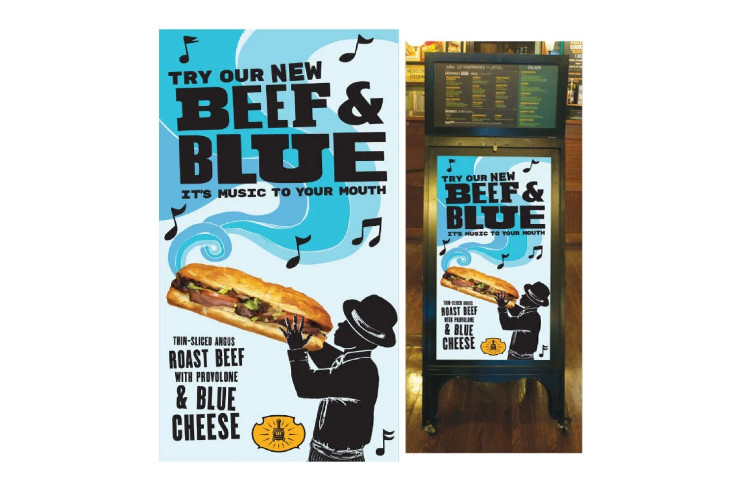
Potbelly renamed its roast beef and blue cheese sandwich from “Black and Blue” to “Beef and Blue.”
I developed a blues-inspired visual direction drawing from mid-century letterpress concert posters, combining custom illustration and hand-styled typography with existing brand sandwich artwork.
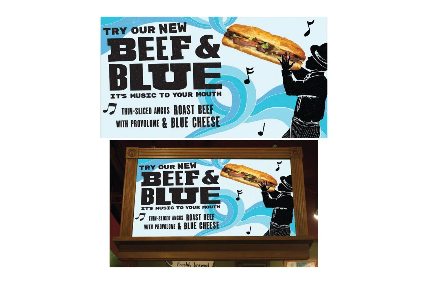
Because the blues-poster reference was unfamiliar to some stakeholders, I helped educate the broader team on the visual history behind the concept and advocated for the direction while maintaining brand clarity and readability.